Perfect Lives
Emigre 29 The Designers Republic Issue
Emigre 29 The Designers Republic Issue
Couldn't load pickup availability
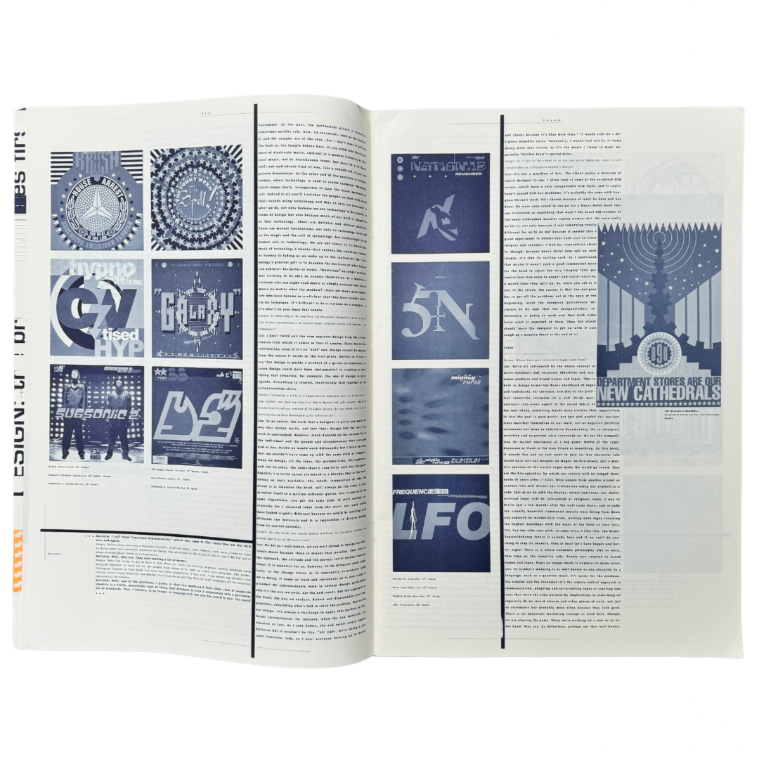
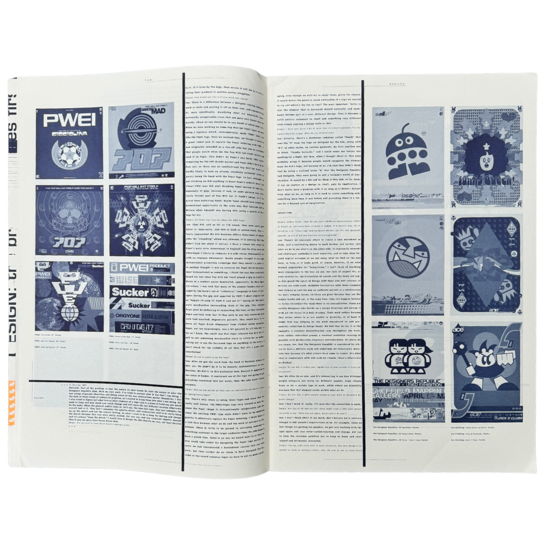
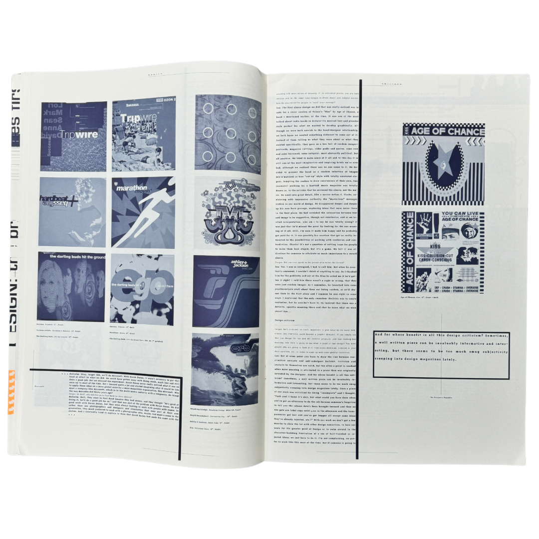
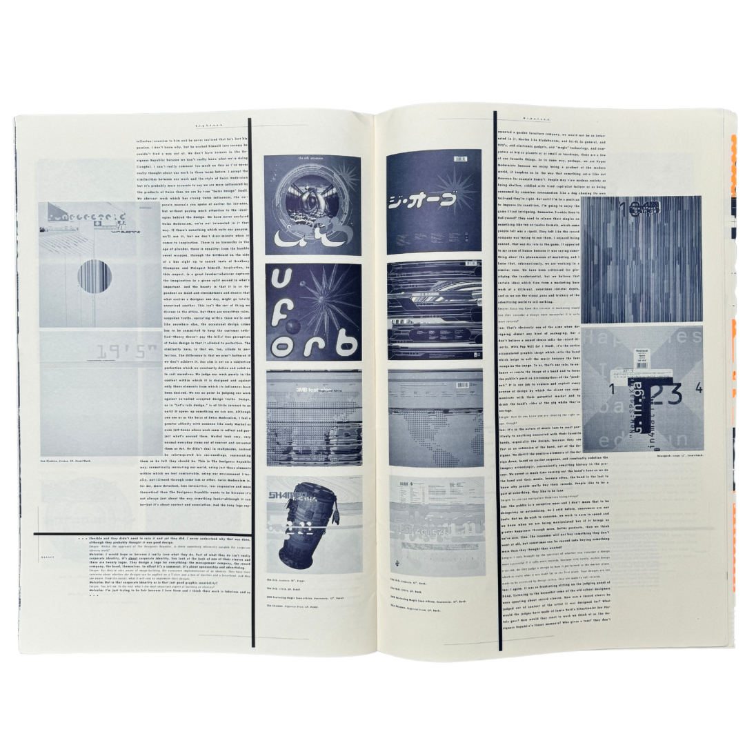
A slightly bruised but lovely copy of issue 29 of the design journal Emigre focussing on the groundbreaking Sheffield collective ‘The Designers Republic’, who were responsible for the designs behind Aphex Twin, Autechre, Warp, Nine Inch Nails, The Orb and Rockstar Games to name a few. There’s a lovely write up of this issue and the story behind it in tDR’s own words:
In 1993, California-based Emigre Magazine founder / editor approached The Designers Republic about collaborating on a TDR-dedicated issue of the magazine. He told me that, having seen various of our record covers, he thought we were the natural successors to Wolfgang Weingart. So we went look up who Wolfgang Weingart was. Then, as now to a degree, we were more than happy in our isolation in Sheffield, protecting it, building a mystique and genuinely not being too interested in what people thought, other than our clients. Design magazines and the stuff inside them was a different world. What I liked about Emigre was that it was designed, but playful — some of it is almost anti-design — and it featured other designers who were searching for something more than to just satisfy clients.
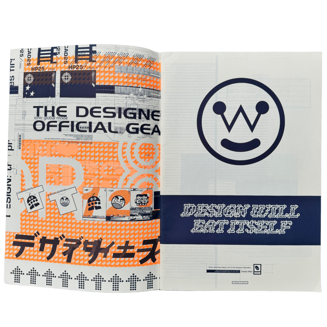
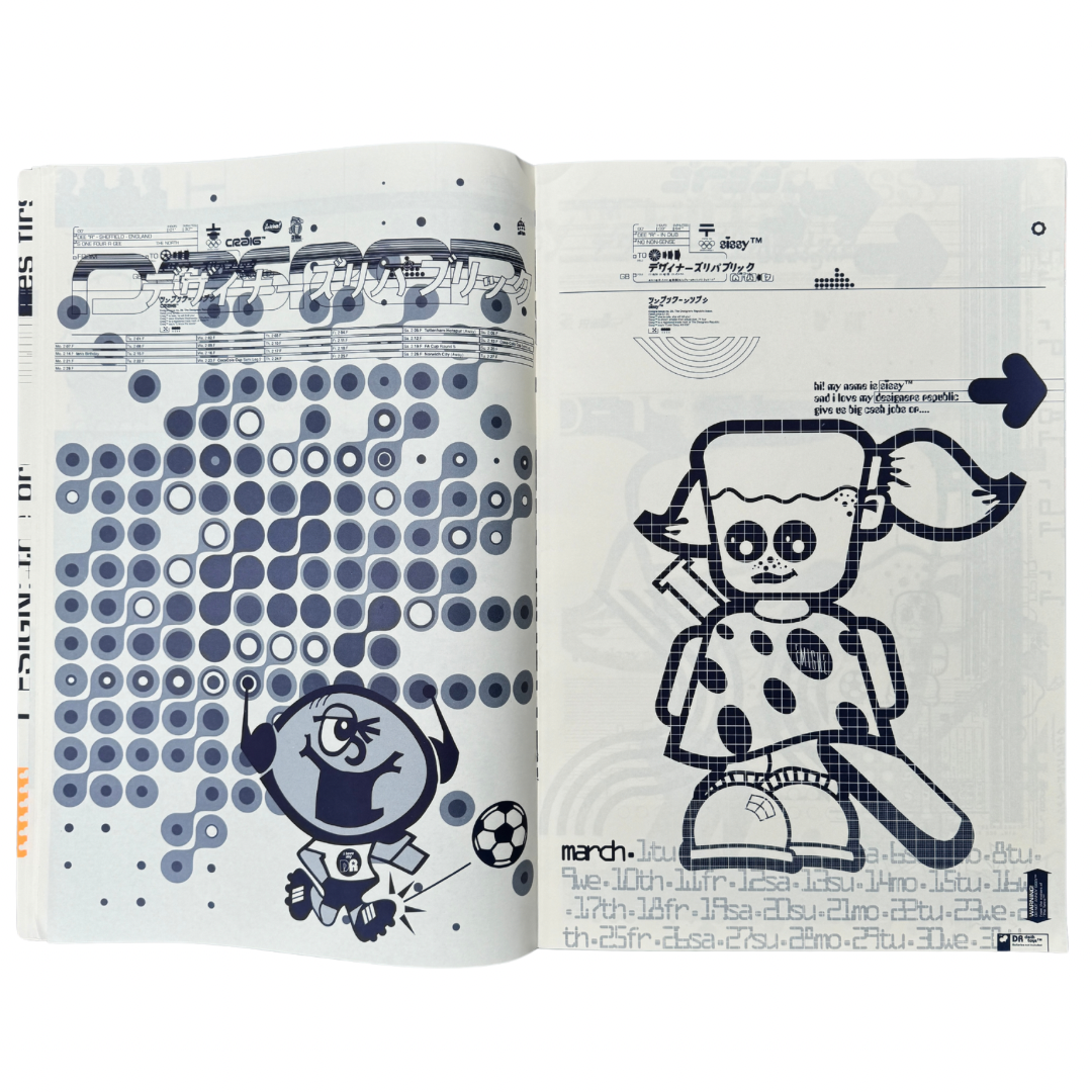
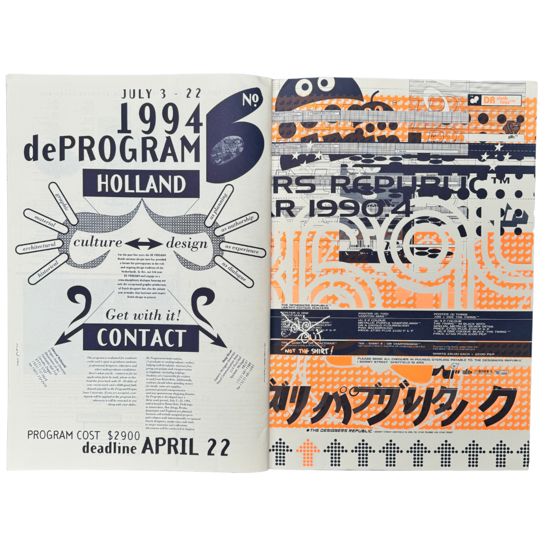
He came over to Sheffield, stopped at my house for a few nights — he planned to do a long interview with me and show some of our work, and wanted us to do the cover. I asked if we could do some of the pages inside and so we did a 12-page section, nominally a calendar (I always liked things like those fixture pull-outs in Shoot magazine). So we went about appropriating bits and pieces of our work and cramming it all together, sampling and remixing if you like, to find something new. Hypercolour distilled into one colour design. This was really the beginning of our ongoing process of reappropriating personal work for clients as client work for ourselves, juxtaposing seemingly random elements into cohesive auteuresque communication — fine tuning subliminal whispers in work for others into something with a specific TDR voice.
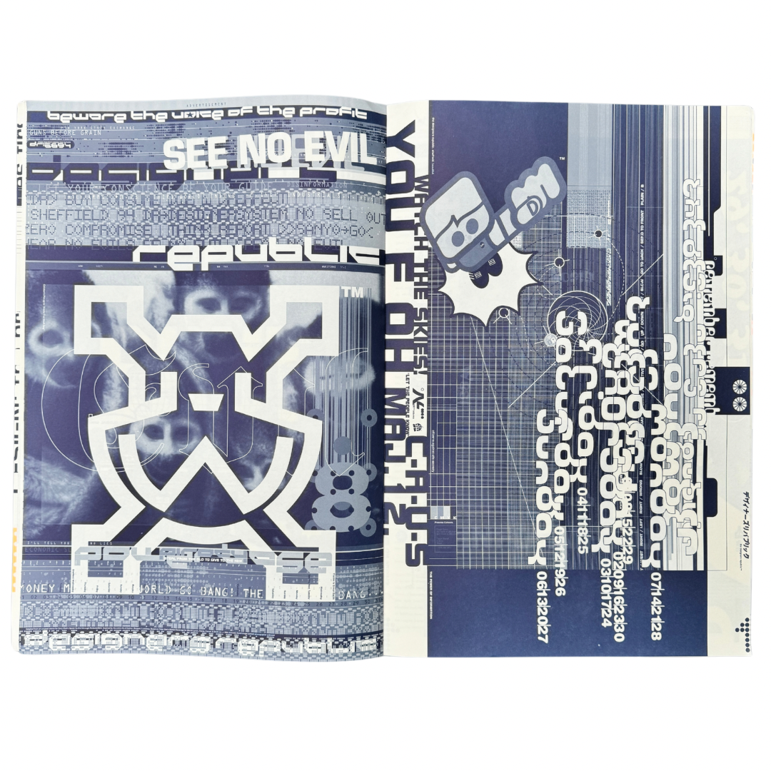
Somewhere in the process we became obsessed with the deconstruction of commercial design and form rebuilding the medium as our message, obliquely commenting on the process in and off itself. I’m not sure we thought of it in those terms at the time, we were too focussed on the maximalism of ‘destroying minimalism’ and the beginning of a consumerist ‘everything multiplied by everything else’. Rudy said he thought we were pulling the pants down of serious design — In Nick Bell’s Emigre issue he had ‘This page is a door’, so we had ‘This page is a piece of paper’ — knowingly de- then re-mystifying the creative process for an audience pre-disposed to react to such strategies — a target audience who saw itself as anything but.
Emigre was the point where a lot of people we considered to be serious designers — i.e. not like us, you know, professionals — took notice, and suddenly we were being talked about in the same breath as them, not just as people who did record covers (before doing record covers was a thing!) Emigre Issue 29 perfectly captured, by intention, encouraged by Rudy, where TDR was at in the early 90s. Its now seen, in hindsight, as a watershed for how design attitudes, approaches, and even the demographic of design changed in the nascent computer-fuelled era. People talk about it as a template for the foundations of Y2K design — for us, at the time it was just a playground, somewhere to dump all the ideas we couldn’t be bothered to convince clients to use. Piracy on the Hi-Tech remixed remade and remodelled.
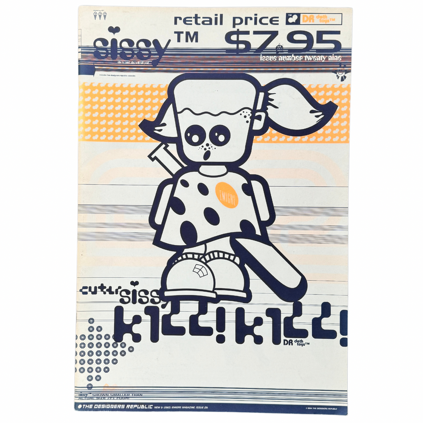
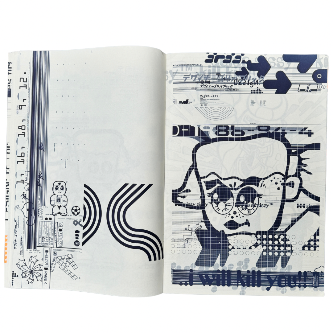
It was also where our starchild DR Sissy debuted. Rudy had commissioned us to design the cover and suggested we take a typically politically TDR view of America which is of course what DR Sissy essentially was — a perspective on then US foreign policy… the ‘have a nice day y’all’ smiling face of friendly American aid backed up with a baseball bat friendly-fire diplomacy of exactly how the favour should be repaid. ‘She is cute she will kill you’.
Objectively its a 40-page A3 magazine printed on matt stock by Cal Central in Sacramento designed in 1993 and published in 1994 as an edition of 6,500 printed Pantone 295 (or similar) throughout adding Pantone 804 on the cover.
Share
